Reducing 'browser detritus'

In part two of my notes and observations about designing our new web app, HR Partner, (part one here) I would like to talk about 'browser detritus'.  What is it?  Well, consider the following scenario.

In most web apps, if you forget your password, there is usually a handy little button or link on the login page somewhere that the user can click.  Usually, this will present him or her with a simple form where they enter their username or email address, and a password reset email will be sent to them post haste.

It is what happens after this that concerns me.  You see, in nearly all cases, the user is sent back to the original login form, along with some sort of notice to check their email for further instructions on resetting their password.

Now, most users would then either switch tabs or apps to their favourite email client, and check their email.  Naturally, most of these reset emails have a special link to click on which will ask the user to reset their password.

But...

Clicking on this link always, always, always opens up a NEW browser window with the reset form on it.  Meaning that the old login screen is still sitting, waiting, in the back there somewhere - now lost among a sea of browser tabs (in MY case, those tabs are spread across 3 different browsers usually).

Invariably, after going through this scenario myself, I will go to do some 'tab housekeeping' at the end of the day, and I will come across sign on screens still waiting for me like a faithful puppy at a train station.  Some days I cannot remember if I indeed reset that password yet, or if it was still something I had to do?

But look - I am as guilty as the next programmer/designer.  Our own web apps to date follow this same paradigm.

I decided to change that with HR Partner though.

At the risk of incurring the wrath of UX specialists everywhere, I actually introduced 'dead ends' in our web app sign on procedure.  When you tell HR Partner that you have lost your password, you will still get that form asking for your email address, but then, you will see a screen that tells you to check your email, and nothing else.  The screen does not even link back to any other screens in HR Partner, but instead asks you to close that browser window down now.

Our normal sign on screen - Whoops, I have forgotten my password.  No problems, click on the link...

Our normal sign on screen - Whoops, I have forgotten my password.  No problems, click on the link...

This is easy - I'll just type in my email address here...

This is easy - I'll just type in my email address here...

Aaaand - dead end! No going back, no going forward. Just close the browser window and wait to open another one automatically when you get the email...

Aaaand - dead end! No going back, no going forward. Just close the browser window and wait to open another one automatically when you get the email...

Is this too regimented? I think it is a step towards avoiding tabmageddon myself.  We are still in development with our web app, so might change this later, but for now, we have introduced these dead ends in a few spots during the onboarding process, including:

1. When the user asks for a password reset. [We have a password reset link in the email]

2. When the user asks for a reminder email with their company specific sign on link. [We have links in the email which take them straight to their required company link]

3. When the user reaches out to a company admin to be invited to join an existing HR Partner company. [We have to wait for the request to be approved by an admin, after which an email will be sent out with a link to complete their sign on process]

I must admit that deliberately designing this many 'dead ends' in an app made me pause at first, but I think at the end of the day it might be a good thing for the end user experience.  What are you thoughts?

Company hopping - the new work culture

Well, we are busy building our latest web app project, and this particular one is interesting in that it has clearly demonstrated how this niche target industry has changed in the last decade.

Backstory: We design an HR management app call HR Partner a long time ago in 2004.  Back then, it was a Windows based app, and was tied in very specifically to a particular legacy payroll system.  We did very well out of that application, but lack of support from the legacy payroll vendor and other reasons meant that we let that project slowly die on the vine.

However, we have had a solid core of users still using that system to this day, and who keep asking us when we are going to update it and add more to it.

Well, that lead me to decide to take up the mantle again, but this time, we are doing it differently.  While the core of the product will be similar, we will now be (a) building it as a purely web based application, rather than Windows, and (b) we will not be locking it into one vendor, but instead be able to integrate with several other more modern payroll systems out there.

In talking to existing users though, one point that I had never considered became more apparent.

Back in 2004, it was quite normal for most medium to large companies to have an internal HR manager on the staff.  Quite frequently, the Payroll manager also acted as the HR manager, instead of having a complete separation of duties.  In any case, it was really easy to just have internal team members working on their own isolated HR system, and everyone seemed happy.

However, the current batch of users that we have been talking to are painting a completely different picture.  Nowadays, it seems that more and more of the HR work is being outsourced to external consultants who are not attached directly to the company.

When we spoke to some of these consultants, they in turn gave us a look at their typical work patterns; which was to provide services to multiple companies, either in the same or totally different fields.  They explained that a lot of the times, internal staff and managers wanted to have complete control of the data, but they would look to external agencies to analyse that data and tell them how they could actually make better use of it.

This threw our design specs off kilter a bit.  In all our other web apps, building the sign on and authentication systems was easy.  You had one company, that all the data belonged to.  And within that company, you have one or more users who could create accounts directly attached to that company so they could work on the data.  If a user wanted to do work on another company, they would have to create a new sign on account for the other company to do work there.

We looked at our audience, and figured that this old method would not work.  The considerations we had were:

  • We would have users that would still want to only work on their own company, and are not interested in working in others, and
  • We would have users who would not 'belong' to any one specific company, but instead would be working on several and jumping back and forth on a regular basis.

Trying to cover all these bases proved to be quite tricky.  There were a lot of edge cases where we were not sure that things would flow well.  Maintaining security and privacy in this industry is quite critical, but at the same time, we didn't want that to put up too many roadblocks to people onboarding and using the system.

What we decided to do was to divorce the user authentication system from the company database system.  

How it works is - Users could still sign on and create a new company.  They would then become the 'owners' of that company.

Other users could then apply to be invited to a company.  The company owners would have to approve them joining up.  Other users could apply to join multiple companies if they liked, and use a single sign on to interact with all the companies they belong to.

I know this is not new ground, and that plenty of other systems utilise this methodology, but it was a new thing for us to tackle in our own design and development work.

Technologically, it was quite simple to manage.  What really had us stuck was the UX factors.  We wanted to make the process as easy and seamless as possible.  As I mentioned, I was surprised at the number of edge cases we came across with this new paradigm.  Problems that we had to think through were:

1. The new user conundrum

What happens when a completely new user wants to join a company?  Should we make them go through the whole process to set up their account details first, verify their account, then shoot a request to the company to see if they will be allowed to join?  

Our answer to this one was NO.  We would simply collect their name and email address on the request form and send it to the company admin.  IF the company admin approved them joining, then we would quietly create their account in our system using this information, and send the invitee an email asking them to click a link to set a password on their newly created account and log in straight away.

BONUS - As part of the '2 click' approval steps the company admin has to do, they are presented with a screen where they can customise the security parameters for the applicant.  They can, for instance, opt to lock the new applicant out of certain sensitive screens or prevent them from editing employee information etc.  That way, when the applicant first logs in, they are already preconfigured for what they are allowed/not allowed to see.

2. The old user failing to remember

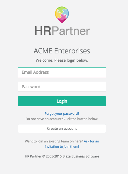
To enable quicker sign ons, we give every company on HR Partner their own custom sign on URL link.  The problem with a consultant who signs on to a dozen companies is remembering these links.

To solve this, we make it easy from the sign on screen for the user to get an email from us listing all the companies that they have been approved to work with, and a 'one click' sign on link for each company.  No need for them to write it down or save it.  If they move to another machine (or mobile device) without the bookmarks, they can easily get another list sent to them within seconds.

BONUS - The user does not have to remember different passwords.  Just the URL, which is actually just the subdomain of the company, in the form of [company id].hrpartner.io/user/login

3. Dealing with bad users

One problem we are still working on is - what do we do with users who are removed from a company because of bad behaviour?  Say someone did something naughty in Company A, and were booted out by the admin.  Do we then have an obligation to tell Company B and C (if the user is authorised to use those companies as well)?

At this stage, we don't collect any information as to WHY the user was dissociated from a company.  We simply let the admin 'deauthorise' them.  Perhaps later we can collect reasons, and look at a process for vetting out problematic users to protect all our customers.

4. Handing over admin control

At present, we allocate the first company who created a company as the site administrator, who is responsible for approving new users who want to join.  We have not yet built in a mechanism for handing over control of a company to another user, but given the transient nature of so many people's jobs these days, I am thinking this is something we will have to do.

Once again, this will have to be carefully managed, as the company admin is essentially 'god', with many powers over the data and privacy of information.  We will have to build in safety checks with respect to the handover, but once again without affecting the UX negatively.


I would appreciate some feedback from anyone else out there who has tackled these sorts of issues in the past, or who could offer some tips and suggestions as to how we handle further development.  I intend to post a few more posts like this as we come across design issues on HR Partner.  Hopefully it will prove useful to the design and development community.


Why do most people give up after one try? I blame Wile E. Coyote!

Most people of my generation grew up with Saturday morning cartoons on TV.  One of my favourites was always watching Wile E. Coyote endlessly chasing the Road Runner.

I don't know about you, but I was always rooting for the coyote, and straw polls among my peers seemed to show a similar sentiment.  We all craved for the day that Wile E would triumph and be rewarded with a road runner roast.  (Rumour has it that there was ONE secret episode in which he actually won, but furious Googling and Youtubing has yet to reveal this treasure.)

But even as a young impressionable kid, I was always vexed by two questions.

1. How did Wile E afford all that gear and equipment from Acme Inc. ??  He must have either had a large stash of money somewhere, or else a great line of credit with the company.

1b. And if he DID indeed have access to lots of cash, why didn't he just BUY himself a Kentucky Fried Roadrunner family dinner instead of trying to hunt one himself?  Perhaps he was just in it for the thrill of the chase?

2. Why did Wile E always give up after the first try?  I mean, he would invest a LOT of money and time in setting up the most elaborate traps, but as soon as one tiny thing made it all go wrong, he would give up and move onto the next idea, instead of retrying or improving his first idea.


I think it is this second factor that has become imbued in a lot of people in my generation.  I keep meeting peer entrepreneurs who tell me sorry tales of woe where they tried something the once, noticed that it didn't work, then dropped it like a hot potato to move on to the next thing.

Usually when I probe further and ask them if they tried to pivot their idea in some way or revisit it with some changes, I am met with an incredulous stare.  They almost always never considered trying again.

I blame Wile E.

In a lot of ways, Wile E. Coyote is much like a lot of funded startups these days:

  • A LOT of disposable cash, with a high burn rate
  • 'Fail fast' manifesto - pick and, dust off and try something new after every failure
  • Quick iteration from concept to execution, with bare minimum planning beforehand, or else planning as they go along
  • Single track focus on ONE end result, but with many paths to get there

Arguably some good traits in there, but there is always room for improvement.  I always wondered what would have happened if Wile E had grown intellectually and emotionally and perhaps explored the possibilities of:

  • Using guile to befriend and win the trust of the Roadrunner before capturing him
  • Had 'guaranteed performance' contracts drawn up with Acme Inc. that would have insured him against failure and allowed him to replace failed equipment at no extra cost
  • Used his money and influence to organise other coyotes in the area to work together to capture roadrunners

Perhaps the generation of entrepreneurs that grew up with those messages may be going things slightly differently nowadays?  

Well, at least MY Saturday mornings may have been a LOT more enjoyable had he done so.

I'm on a bus!

Today, I caught a public bus for the first time since I was in school - well over 30 years ago!  But I had to drop my car off for a service early this morning, and decided to walk into the city and catch a bus back home.  Purely on a whim.

I decided to look at the differences then and now, with the whole experience.

When I was younger, I don't think I EVER looked at a bus timetable.  I would just turn up at a bus stop, and unless it was a Sunday (the buses in my town don't run on Sundays), I would just wait until one turned up and hop on it.  I guess my concept of time was pretty elastic and I would not consider a 40 minute wait to be 'terrible' as compared to a 5 minute wait.  I would simply wait.

Nowadays, I realise that my concept of 'time' is sliced into distinct categories.  I looked at the bus timetable this morning and realised I would have a 20 minute wait for the next one.  That seem like an interminably long time to me, and I found myself making plans in my head about how I would optimise that wait time.  I could walk down the road and pop into a shop to get a drink...  then perhaps sit on a bench in the park across the road and write a little in my Field Notes book until it was departure time...  The plans were coming thick and fast.

I decided that No - I would simply sit and wait.  And do nothing.  I would steel myself against getting my iPhone out and whiling away the time.  I would just sit with no distractions.  (Actually, I ended up unintentionally eavesdropping on the loud conversation the lady sitting next to me was having on HER iPhone!).

While waiting and glancing at the information panels around the bus stop, I saw a notice advertising the bus services new app.  You could track where all the buses were, and see in real time where the bus you were waiting for was with it.  How cool.  So much information at your fingertips these days.  I was tempted to make a dive for my phone and download the app, but I successfully restrained myself.

Finally, my bus arrived.  I got on an enquired about the fare.  It was $3.  Exactly 10 times the fare I paid on my last bus trip 30 years ago as a kid, which was 30 cents.  I smiled inwardly at these salient coincidental facts.

Once seated, I noticed that the buses these days were far more comfortable that those of yore, and actually had working air conditioning that transformed the whole vehicle into an icebox.  Very nice in our usual warm weather.

I couldn't contain myself any longer, and reached for my phone.  This was where I was pleasantly surprised again to note that the buses now have free WiFi access on board.  Nice.  Just what the current 'always connected' generation would expect, and need.

I glanced around the bus as we travelled, and noticed that virtually all the passengers were older people, and that NONE of the other passengers seemed to be taking advantage of free WiFi or using their phones.  They were actually kicking back and looking out the windows. 

I decided to put away my phone and do the same.

Eventually, I reached my stop near home, and hopped off.  I walked the final few hundred metres to my house enjoying the mid morning warmth of the sun, and listening to Greek workmen in a building lot swearing at each other in 3 languages, and reflected at how great life was, in my very brief step back in time to a no technologically obsessed world.