
We have been using the excellent Help Scout support and knowledgebase system here at my startup for many years, and recently, the customer success team has been going through and updating many articles that were out of date, and adding new articles for new features and enhancements that we have made recently. (I have posted in the past about how we linked up Help Scout to our SaaS app to enable support team members to see critical details on our customers when talking to them)
While working on the knowledgebase with the team, I thought that our look and feel of the help site didn’t really fit well with the bright and colourful branding of the rest of our web assets (i.e. our website and our blog).
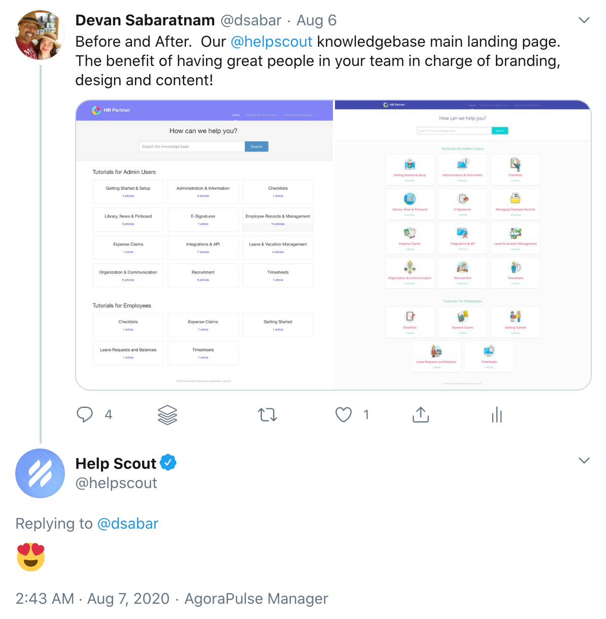
Here is what the Help Scout main help page used to look like:

And here is how it looks now:

A million percent improvement, right? Now we use the same iconography and brand colors across our entire help site as well, which helps to tie everything together.
Once our design team got together to investigate how to improve things on Help Scout, we actually found out how easy it was. You see, Help Scout allows you to upload your own custom CSS style sheet to their server on your control panel. Just go to Manage -> Docs from your top menu, then choose your Document Library, then choose ‘Custom Code’ from the side menu.
Here you can upload your custom CSS.

But what does that Custom CSS look like? Well, it can be as simple or as complicated as you like, but guess what? As part of our spirit of giving back to the community, we have released a custom CSS file right here on this post so that you can use it as a template for creating your own style. Completely free. We’d love to hear how you have used it to improve your own Help Scout documentation pages.
So feel free to download the custom css template and modify it to suit your own needs. Here are some hints and tips for you:
Choose Your Branding Colors
Just go through the CSS template we provided, and set your own preferred corporate colors for things like the category headings (line 89) and the list of articles under each category (line 99).
In our sample, I have just chosen some random color collection from Coolors as an example, so feel free to replace them as needed.
You can also change the button colors (line 396) and article heading colors (lines 320, 327 and 334) etc.
Set Your Category Images
This is probably the trickiest part of setting up your CSS - getting those cool image icons just above your category headings on the main page that all your customers will land on. It actually isn’t that hard (perhaps just a little tedious).
First, you will need to host all the images you need on a server somewhere on the internet. Help Scout cannot host your images on their system unfortunately, so you need to find somewhere like Github Pages, or set up a spot on your own webserver, or use Amazon S3 like we do to host your images.
Then, once done, you will need to find out the Category IDs that Help Scout gives each of your help categories. Every time you create a new category in Help Scout, they will allocate it a 3 digit unique code. How do you find out that code? Well, the easiest way is to simply browse that category in your knowledgebase:

In the above example, I have gone to the ‘Custom Forms’ category, and by looking at the URL bar in my browser, I can see that the category URL is ‘150-custom-forms’, hence it has the ID ‘150’.
So, what I need to do in my CSS file is to create a ‘CSS Selector’ block which specifies the category ID like:

Then within that block, specify the background-image CSS property with the location of the image icon file on your hosting server. See lines 214 onwards within the sample CSS for what it looks like.
That is really about it! If you are a CSS guru, you can feel free to modify anything else you like in that file. As I said before, we’d love to see what you come up with. I guess even the Help Scout crew were happy with what we did given their response when I posted the results on Twitter last month…
Get your copy of the Help Scout Custom CSS Branding template here (right click and select ‘Save As…’). Have fun!
Disclaimer: CSS template is provided ‘as is’. No warranty expressed or implied. No guarantee as to the suitability for purposes is given. You use the CSS script and associated code at your own risk.
UPDATE: We have now embedded the CSS right here on this post as well:
/* Custom Help Scout StyleSheet - by Devan Sabaratnam (founder of HR Partner - www.hrpartner.io) */ /* Color pallette chosen from https://coolors.co/54494b-7e8287-9da39a-b98389-db2955 */ @import url('https://fonts.googleapis.com/css?family=Open+Sans:100,200,300,400,400i,500,700'); /* */ body { background: #fbfbfc; } /* Home Page Title */ #docsSearch h1 { font-size: 32px; font-weight: 300; text-align: center; margin-top: .4em; font-family: "Open Sans", sans-serif; color: #222256; padding: 10px; } .navbar .nav li { display: inline-block; float: none; font-family: "Open Sans", sans-serif; font-size: 13px; letter-spacing: .1em; } .navbar .nav li a, .navbar .icon-private-w { font-size: 14px; font-weight: 300; } /* Header Size */ a.brand > img { max-width: 100%; vertical-align: middle; border: 0; height: 60px; margin-left: 15px; width: auto; } .navbar .navbar-inner { /* background: #ffffff; */ height: 60px; } .navbar .navbar-inner .container-fluid { padding: 0; height: 60px; } .navbar .brand { float: left; display: block; padding: 0px; margin-left: -20px; font-size: 20px; font-weight: 200; color: #777; text-shadow: 0 1px 0 #fff; } /* Home Page Search Bar Background */ #docsSearch { background: #ffffff; border-top: 1px solid #dadada; margin-bottom: 3em; padding: 1.5em 0; } /* Search Input Box */ input.search-query { padding-right: 14px; padding-right: 4px \9; padding-left: 14px; padding-left: 4px \9; margin-bottom: 0; border-radius: 15px; border-radius: 15px; border-radius: 15px; font-family: "Open Sans", sans-serif; font-weight: 100; letter-spacing: 1px; } /* Home Page Category Title*/ .category-list h3 { color: #db2955; font-size: 20px; font-weight: 400; line-height: 1.3em; font-family: "Open Sans", sans-serif; } /* Category Styles */ .category-list .category p { color: #7e8287; font-family: "Open Sans", sans-serif; font-weight: 100; font-size: 15px; letter-spacing: 0.25px; } .category-list .category { background-color: #fff; background-position: top 20px center !important; background-repeat: no-repeat !important; background-size: 100px auto !important; box-shadow: 0 7px 4px -5px rgba(0, 0, 0, 0.05); box-sizing: border-box; min-height: 183px; padding: 120px 20px 15px; position: relative; width: 31.5%; transition: all 0.2s; } .category-list .category:hover { text-decoration: none; background: #f7f7f9; } .collection-category h2 { font-weight: 500; margin: 0 0 20px; text-align: center; padding-left: 0%; font-family: "Open Sans", sans-serif; /* text-transform: uppercase; */ color: #7e8287; font-size: 22px; letter-spacing: 1px; } .collection-category h2 a { color: #3db890; } .collection-category .category-list { margin: 0 0 4em; text-align: center; } /* Home Page Link Style */ #serp-dd .result a, #serp-dd .result>li.active, #full-Article strong a, .collection a, .contentWrapper a, .most-pop-articles .popArticles a, .most-pop-articles .popArticles a span, .category-list .category .article-count, .category-list .category .article-count, .contentWrapper a { font-weight: 500; letter-spacing: .25px; color: #3db890; margin-top: 15px; text-transform: capitalize; text-decoration: none; font-family: "Open Sans", sans-serif; font-weight: 500; } #serp-dd .result a:hover, #serp-dd .result>li.active, #full-Article strong a, .collection a, .contentWrapper a, .most-pop-articles .popArticles a, .most-pop-articles .popArticles a:hover span, .category-list .category .article-count, .category-list .category:hover .article-count, .contentWrapper a { font-weight: 500; letter-spacing: .25px; color: #3db890; margin-top: 15px; text-transform: capitalize; /* text-decoration: underline; */ font-family: "Open Sans", sans-serif; font-weight: 500; } /* Home Page Search Button */ #searchBar button { color: #fff; text-shadow: 0 0px 0px rgba(255,255,255,.0); background: #03d3d5; border-radius: 0 5px 5px 0; border: 1px solid #b98389; font-size: 18px; padding: 0 1.5em; height: 50px; position: absolute; } #searchBar button:hover { background: #2dd3fd; text-shadow: 0 0px 0px rgba(255,255,255,.0); border: 1px solid #2ad7d7; } input, button, select, textarea { font-family: "Open Sans", sans-serif, "Helvetica Neue", Helvetica, Arial, sans-serif; } /* Category Images */ /* Here is where you determine the images to be used just above each section of your Help Scout main page. You have to create one #category-xxx CSS selector for each separate category in your Help Scout collection. To get your category xxx number, simply visit the relevant category in your Help Scout docs and check the URL bar for the 3 digit category number. Then you have to specify an image located on a shared server somewhere on the internet that can serve up the images so Help Scout can display them. */ /* Getting Started (use your actual category names here in the comment to make it easier */ #category-123 { background-image: url(https://storage.myhostingprovider.com/public/images/123-getting-started.png); } /* Setup Users */ #category-456 { background-image: url(https://storage.myhostingprovider.com/public/images/456-setup-users.png); } /* Uploading Files */ #category-223 { background-image: url(https://storage.myhostingprovider.com/public/images/223-uploading-files.png); } /* etc... keep going and add one CSS ID selector for each category. */ /* Side Bar Styles */ #sidebar .nav-list a { display: inline-block; color: #4333d6; font-size: 14px; padding: 6px 15px 6px 0; line-height: 20px; margin-left: 0; font-family: "Open Sans", sans-serif; font-weight: 300; } #sidebar .nav-list .active a, #sidebar .nav-list .active a:hover, #sidebar .nav-list .active a:focus { font-weight: 500; color: #06b9dd; background: 0 0; text-shadow: none; text-decoration: underline; } #sidebar h3 { text-transform: uppercase; font-size: 16px; color: #7e8287; font-weight: 400; margin-bottom: 4px; font-family: "Open Sans", sans-serif; letter-spacing: 2px; } /* Article Styles */ #main-content { background: none; float: right; margin-bottom: 2em; padding: 32px 0 0 28px; } #fullArticle img { display: block; margin: 1em 0 2em; padding: 4px; border-radius: 4px; box-sizing: border-box; } #fullArticle .title, .contentWrapper h1 { margin: 0 30px .5em 0; font-family: "Open Sans", sans-serif; color: #db2955; font-weight: 700; } #fullArticle .printArticle { position: absolute; right: 46px; top: 40px; } #fullArticle, #fullArticle p, #fullArticle ul, #fullArticle ol, #fullArticle li, #fullArticle div, #fullArticle blockquote, #fullArticle dd, #fullArticle table { color: #7e8287; font-family: "Open Sans", sans-serif; font-size: 14px; font-weight: 300; letter-spacing: .01em; } #categoryHead .sort select { width: 150px; height: 24px; margin: 0; line-height: 24px; font-size: 13px; color: #7e8287; font-family: "Open Sans", sans-serif; font-weight: 300; } /* Style this one if you want bolded article text to have a different color */ #fullArticle strong { color: #7e8287; } #fullArticle h2 { font-size: 24px; font-family: "Open Sans", sans-serif; font-weight: 400; color: #db2955; } #fullArticle h3 { font-size: 20px; font-family: "Open Sans", sans-serif; font-weight: 700; color: #db2955; } #fullArticle h4 { font-size: 16px; font-family: "Open Sans", sans-serif; font-weight: 300; color: #7e8287; font-style: italic; } .contentWrapper p { margin-top: -4px; word-wrap: break-word; font-family: "Open Sans", sans-serif; color: #7e8287; font-weight: 300; font-size: 16px; letter-spacing: .01em; } /* Article Footers */ .articleFoot p, .articleFoot time { color: #7e8287; display: inline-block; font-family: "Open Sans", sans-serif; font-weight: 300; font-style: italic; } /* Page Footers */ footer p a { color: #7e8287; font-family: "Open Sans", sans-serif; font-weight: 300; } /* Contact Modal */ #contactModal h2, .abuse h2 { background: #fff; margin: 0; padding: 11px 0 10px 18px; font-size: 22px; border-bottom: 1px solid #ccc; border-top-left-radius: 4px; border-top-right-radius: 4px; font-family: "Open Sans", sans-serif; color: #58A4B0; font-weight: 300; } #contactModal .control-label { width: 110px; font-family: "Open Sans", sans-serif; font-size: 14px; font-weight: 300; color: #7e8287; } .btn { color: #fff; text-shadow: 0 0px 0px rgba(255,255,255,.0); background: #03d3d5; border-radius: 5px; border: 1px solid #b98389; font-size: 14px; padding: .5em; /* height: 50px; */ } .btn:hover, .btn:focus, .btn:active, .btn.active, .btn.disabled, .btn[disabled] { color: #fff; text-shadow: 0 0px 0px rgba(255,255,255,.0); background: #8fa7c2; border: 1px solid #9da39a; } #search-query .btn:hover { color: #fff; text-shadow: 0 0px 0px rgba(255,255,255,.0); background: #8fa7c2; border-radius: 5px; border: 1px solid #9da39a; font-size: 18px; padding: 0 1.5em; height: 50px; } .category-list { text-align: center; } /* Fix for making homepage category gallery go smoothly from 3 to 2 to 1 column */ @media screen and (max-width: 1105px) { section.category-list .category { width: 48.2%; } } @media screen and (max-width: 760px) { section.category-list .category { box-sizing: border-box; margin: 0 0 20px; padding: 120px 20px 15px; width: 100%; } } /* RESPONSIVE */ @media (max-width: 768px) { .navbar .btn-navbar { margin-top: 16px; right: -10px; } .related { padding: 30px 25px 25px; } .related ul { margin-left: 0; } .related h3 { padding-left: 0; } .related ul>li a { margin-left: 0; } } @media (max-width: 480px) { #searchBar button { color: transparent; text-shadow: 0; background: transparent; border-radius: 0 5px 5px 0; border: 0; font-size: 18px; padding: 0 1.5em; height: 50px; position: absolute; } #searchBar button .icon-search { display: block; text-shadow: none; margin-top: 15px; } #searchBar button:hover .icon-search:hover { display: block; text-shadow: none; margin-top: 15px; background-color: transparent; } } @media (max-width: 480px) { #fullArticle .title, .contentWrapper h1 { font-size: 24px; } #fullArticle h2 { font-size: 20px; } } /* Collection Titles */ .collection-category h2 a { color: #54494b; } .collection-category h2 { font-weight: 400; margin: 0 0 20px; padding-left: .65%; font-family: "Open Sans", sans-serif; text-align: center; }