In part two of my notes and observations about designing our new web app, HR Partner, (part one here) I would like to talk about 'browser detritus'. What is it? Well, consider the following scenario.
In most web apps, if you forget your password, there is usually a handy little button or link on the login page somewhere that the user can click. Usually, this will present him or her with a simple form where they enter their username or email address, and a password reset email will be sent to them post haste.
It is what happens after this that concerns me. You see, in nearly all cases, the user is sent back to the original login form, along with some sort of notice to check their email for further instructions on resetting their password.
Now, most users would then either switch tabs or apps to their favourite email client, and check their email. Naturally, most of these reset emails have a special link to click on which will ask the user to reset their password.
But...
Clicking on this link always, always, always opens up a NEW browser window with the reset form on it. Meaning that the old login screen is still sitting, waiting, in the back there somewhere - now lost among a sea of browser tabs (in MY case, those tabs are spread across 3 different browsers usually).
Invariably, after going through this scenario myself, I will go to do some 'tab housekeeping' at the end of the day, and I will come across sign on screens still waiting for me like a faithful puppy at a train station. Some days I cannot remember if I indeed reset that password yet, or if it was still something I had to do?
But look - I am as guilty as the next programmer/designer. Our own web apps to date follow this same paradigm.
I decided to change that with HR Partner though.
At the risk of incurring the wrath of UX specialists everywhere, I actually introduced 'dead ends' in our web app sign on procedure. When you tell HR Partner that you have lost your password, you will still get that form asking for your email address, but then, you will see a screen that tells you to check your email, and nothing else. The screen does not even link back to any other screens in HR Partner, but instead asks you to close that browser window down now.
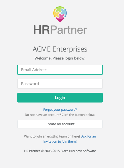
Our normal sign on screen - Whoops, I have forgotten my password. No problems, click on the link...
This is easy - I'll just type in my email address here...
Aaaand - dead end! No going back, no going forward. Just close the browser window and wait to open another one automatically when you get the email...
Is this too regimented? I think it is a step towards avoiding tabmageddon myself. We are still in development with our web app, so might change this later, but for now, we have introduced these dead ends in a few spots during the onboarding process, including:
1. When the user asks for a password reset. [We have a password reset link in the email]
2. When the user asks for a reminder email with their company specific sign on link. [We have links in the email which take them straight to their required company link]
3. When the user reaches out to a company admin to be invited to join an existing HR Partner company. [We have to wait for the request to be approved by an admin, after which an email will be sent out with a link to complete their sign on process]
I must admit that deliberately designing this many 'dead ends' in an app made me pause at first, but I think at the end of the day it might be a good thing for the end user experience. What are you thoughts?


